Tactile Synthesizer Manual
Braille / Accessibility / Tactile Interaction
NYU Integrated Design & Media · 2024–2025 · Collaborative with faculty advisor
NIME Publishing
Developed under the direction of Roger Luke DuBois at NYU IDM, in collaboration with Stefanie Koseff. The project explored how Braille and multimodal design could expand accessibility in communication systems, investigating tactile interaction and inclusive media design. My contribution focused on prototyping, user-centred testing, and connecting design practice with accessibility frameworks.
The Problem:
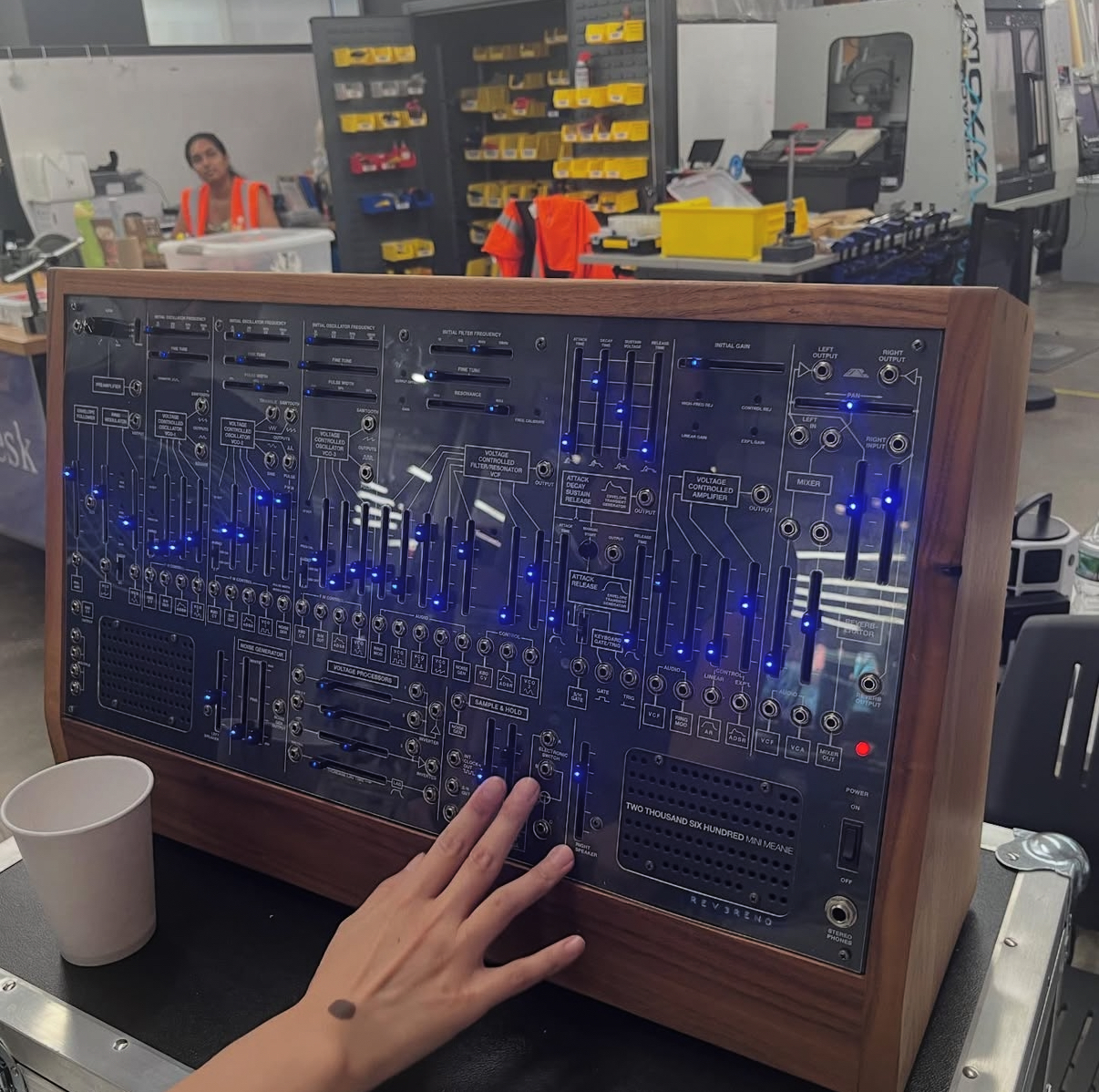
Standard synthesizer manuals are visual-first: diagrams rely on color, spatial position, and fine visual detail to communicate control relationships. For a user who cannot see the panel, these documents are useless.The core design challenge was not just "how do I add Braille" — it was: how do you translate a visual interface into a tactile one without losing the spatial logic that makes the instrument learnable? And beyond this specific instrument: could the solution scale?
Design Process
Step 1 — Understand the user I worked directly with blind and low-vision users to understand how they navigate unfamiliar physical interfaces — what information they need first, how they build spatial mental models by touch, and where existing documentation fails them entirely. These conversations fundamentally shaped the information hierarchy of every page.
Step 2 — Map the interface I catalogued every control type on the ARP 2600: sliders, knobs, patch inputs, patch outputs, bidirectional jacks, switches, and buttons. Each control type required a distinct tactile form that could be learned once and recognized instantly by touch alone.
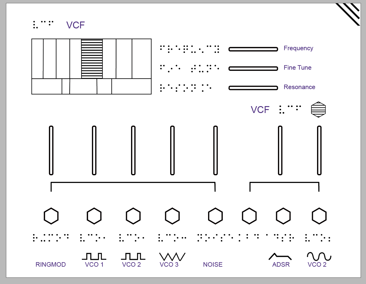
Step 3 — Build a reusable tactile symbol system Before designing any module page, I established a tactile design language — a Key — intended to be both ARP-specific and generalizable to other synthesizers:
- Hexagon (open) = Input jack
- Hexagon (striped) = Output jack
- Circle (dotted) = Bidirectional jack
- Circle (striped) = Knob
- Circle (dotted, filled) = Button
- Vertical line = Vertical slider
- Horizontal line = Horizontal slider
- Waveform glyphs = Signal types (Sawtooth, Triangle, Sine, Pulse, ADSR)
Step 5 — Test with users I tested the manual with blind and low-vision users, observing how they moved through the pages, where the symbol system broke down, and whether the spatial layout transferred to their mental model of the physical instrument. Feedback led to refinements in symbol differentiation and page navigation structure.
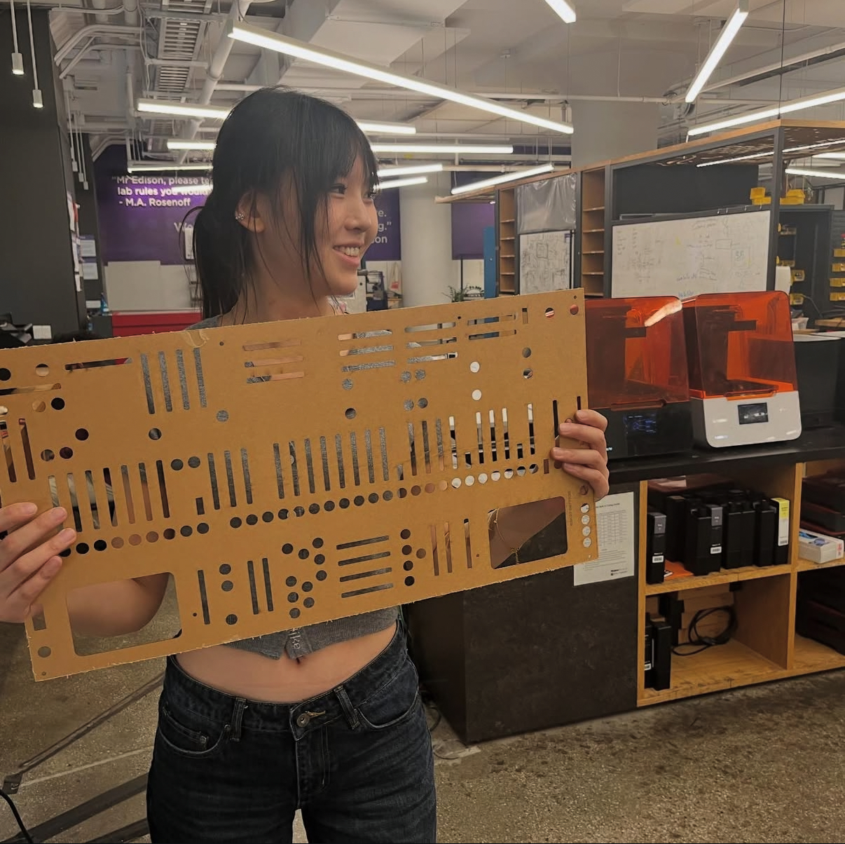
Step 6 — Produce and bind Final output: laser-cut raised-line printing on tactile paper, spiral-bound for flat-page reading by touch.
Each symbol was paired with its Braille label — tactile shape for navigation, Braille text for confirmation.
Key Design Decisions
User-first information hierarchy. Direct testing with blind and low-vision users revealed that spatial orientation — knowing where you are on the panel — was the most critical piece of information. This drove the navigation indicator design (top-left grid on every page) and the decision to mirror physical control positions exactly.
Spatial fidelity over simplification. Each page's layout mirrors the actual physical layout of the synthesizer module. Users build a mental model that transfers directly to the hardware — reducing the cognitive load of switching between document and instrument.
A symbol system designed to scale. The tactile vocabulary was designed with generalizability in mind: the same symbol logic could be applied to document other synthesizers without redesigning from scratch, making it a reusable accessibility framework rather than a one-off solution.
Three-layer communication. Every element carries information simultaneously in tactile shape, Braille text, and printed text — making the manual usable across a spectrum of visual ability and accessible to sighted collaborators and instructors.
Outcome
A complete spiral-bound tactile manual covering all major modules of the ARP 2600, validated with blind and low-vision users, and designed with a symbol system extensible to other instruments. The project demonstrates that rigorous, user-tested accessible design is achievable for complex technical interfaces — and that the process of defining a reusable symbol language, maintaining spatial fidelity, and layering information channels is directly applicable to any accessibility design challenge.


